
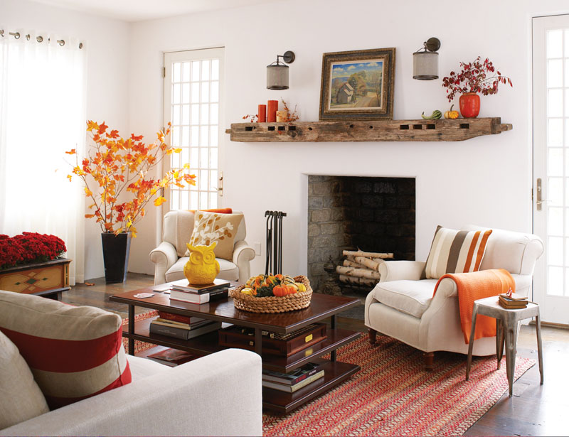
Make a décor statement with the rich colors of Autumn
The first day of fall has already come and gone in a quiet, unpublicized event.
The prolonged heatwaves of summer are probably to blame for our misdirection of the seasonal change. Yet fall, in all its Autumn glory, is officially here. Such a lovely and cozy time of year, as the sun retires earlier each day and cooler temperatures are truly welcomed.
Fall is my most favorite time of the year. The lower temperatures, soups and chili, and wool and colorful plaid accessories mark the beginning of the year-end holidays and the general sentimental feeling of a year inching its way toward a celebratory close.
I love the fallen leaves with rich golds, rusts and reds so deep they have the color, and feeling, of fine wine. These jewel-toned colors are definitely picked right off of Mother Nature’s personal color palette. How else could they be so perfect?
A notion of fall
It’s interesting how colors can affect our state of mind. There’s a notion of fall: a perfect cup of coffee in hand while enjoying a toasty fire, tall suede boots, my big knit sweater, a perfectly tailored trench coat or rain dancing on the family room window because it’s being pushed here and there by the wind that swirls around in our backyard.
Colors can also make a room into a living space. They evoke personal emotions and feelings, creating ambiance and mood.
Regardless of your design project, chances are you’ve had to deal with color. New paint for family or dining rooms, shingles for the roof, a tile scheme for the kids’ bathroom, or putting together an outdoor seating area with drapery hanging from a pergola, upholstered seating and a variety of pillows.
We choose colors because they make us feel a certain way. I think most of us would agree that soothing, relaxing and quiet colors are best for bedrooms. Various tones of gray and blue, red and gold, violet and ivory are always interesting color combinations.
Reflections of mood
We reserve certain living spaces for relaxation and quiet time, and the colors we choose must reflect this mood. The color white doesn’t have to be stark or bleached out. If you look at a paint fan deck from any paint manufacturer, you will see that there are at least 100 white tones. It can have an underlying tone of brown, blue, yellow, pink, green or gray.
Some of the most restful living spaces are those done in various shades of white, with bold accents like a dark hardwood floor or a perfect piece of colorful artwork that sets the tone for the room.
Our kitchens and family rooms are usually vibrant, high-paced living spaces with meals and entertaining, homework and book clubs, football games and poker. These spaces need to have a feeling of energy and life. A white kitchen, though neutral, can still feel energetic with the use of colorful accessories or a colorful painted island. A family room can have a subdued upholstery scheme that’s the perfect foundation to incorporate a wild and colorful area rug or a statement piece of art.
Whatever color schemes move you, the only “must” is that they make you happy – whether they’re bold and bright or quiet and non-descript. Keep color personal, and your design project will always result in success.
Jennifer Leischer owns J. Designs Interior Design based in Clayton. Contact her with questions, comments and suggestions at jenna@j-designs.com.